
Immersive Analytics: Data Visualization in AR/VR
By: Ben Kates
Introduction
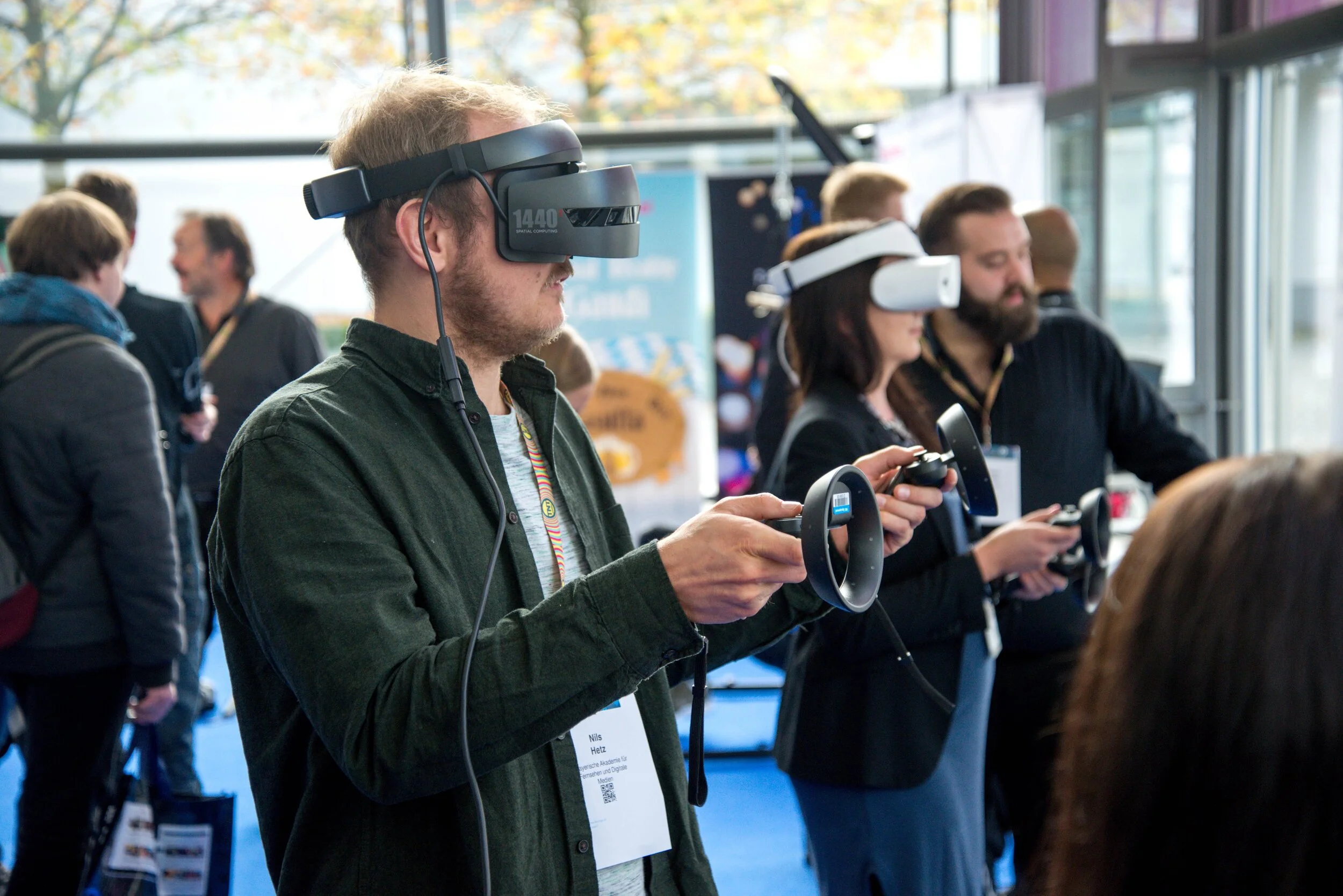
The world of data visualization is reaching a new milestone. As web browsers enable access to the client’s GPU and virtual reality devices become cheaper and untethered, mediums for data storytelling are expanding into the virtual world. Augmented and virtual reality (AR/VR) also known as cross-reality or mixed-reality (XR) was already on a path to adoption in a world without COVID-19. But the demand for virtual, collaborative environments is accelerating with teams working remotely much more frequently.
“Immersive analytics” is a field we think is gaining a lot of traction. At CompassRed and the Delaware Data Innovation Lab (DDIL), we’re exploring how this new medium will enable data professionals to tell better data stories and empower virtual teams to make better, more collaborative decisions.
Here are some product leaders in the space, and some extra solutions that enable developers to build their own virtual data visualization experiences.
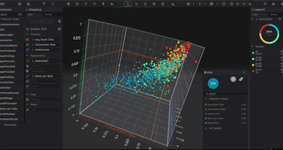
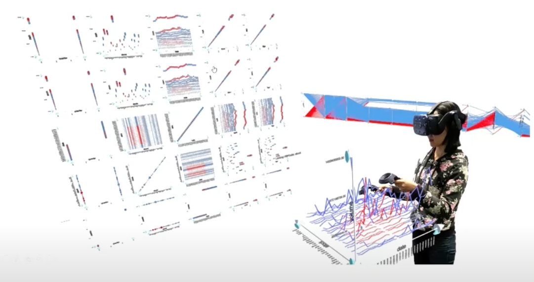
Virtualitics
Virtualitics describes itself as “A Powerful Solution for Explainable AI” and “AI as a Service”. By ingesting data with tens, or even hundreds, of variables its tech can reduce those dimensions to a handful and suggest the best 3D visualization to represent the output. Then, hop into a virtual environment with colleagues to review that data. With clients ranging from the Air Force to Moody’s, this solution is one of the top leaders in the space right now.
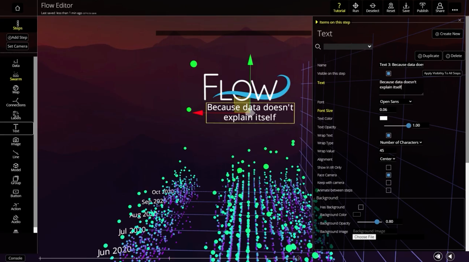
Flow Immersive
Flow is one of the platforms we’re most excited about. After going viral on TikTok a few times, the data story demoes caught our attention due to its accessibility via the WebXR Device API available in many web browsers. Any device running a web browser, from phones to laptops to AR/VR devices, can run the interactive experience. Additionally, it’s a self-serve tool like Virtualitics, where a user uploads data, creates visualizations, and adds “steps” to transition between them.
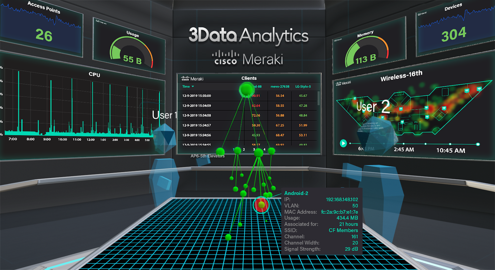
3Data
3Data is a use-case driven approach to data visualization in VR. IT operations is its focus, displaying hundreds of datapoints about devices being used in an organization. Their platform demo shows off a smart assistant called “Apollo” that reacts to voice commands. With seed-funding recently closed, this Web-based solution seems to be paving an Iron Man-like future for IT operations professionals.
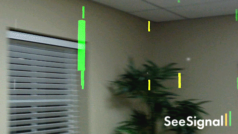
BadVR
Similar to 3Data, BadVR is focused on use cases like telecom, smart cities, and marketing. One of the use cases, seen below, is visualizing wi-fi signal strength. This 2019 grant-funding press release promotes a project with National Science Foundation to “visualize and analyze large geospatial datasets”. Geospatial data is a very common application for visualization in immersive analytics, given that the user can zoom out to get a large overview or zoom in to the point where they are surrounded by the geography.
DIY Solutions
The solutions mentioned so far are paid products, and considering that “data in virtual environments” is still a niche field, the focus will be on monetization in enterprise contexts for the foreseeable future. At DDIL and CompassRed, we’re exploring some open-source and academic work that could pave the way to a world where this technology is accessible by any size organization.
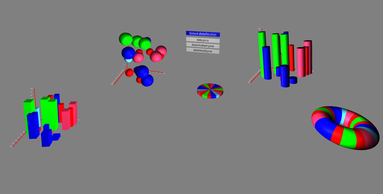
Immersive Analytics Toolkit
Debuted at the 2019 IEEE VR, the Immersive Analytics Toolkit is a developer toolkit for use in game-engine Unity. It enables extensive customization of data visualizations and allows the user to customize the interactions available, like linking data points across chart types.
Blender Data Visualization Plugin
Developed by Zdeněk Doležal, this plugin allows users to create static 3D visualizations of an uploaded csv in popular 3D modeling software Blender. Although not interactive, this solution works well for collaborative virtual environments that allow users to upload 3D model files. We’ve explored Spatial, Mozilla Hubs/Spoke and Frame VR for this use case.
A-Frame Charts Component
Developed by Adrian Pizarro, the A-Frame Charts Component is an API for creating charts in A-Frame, a web framework for building 3D/AR/VR experiences. The key here is that A-Frame is web-browser based (just like Flow Immersive), making it accessible on any device that runs a browser.
As you can see, there are a variety of tools out there for immersive analytics, from business-intelligence focused to narrow use cases. At CompassRed and the Delaware Data Innovation lab, we’re exploring what this technology means for professionals working in a COVID-19 and post-COVID-19 world. We want to make immersive analytics effective for acting on COVID-19 problems and problems created as a result of COVID-19. The long-term goal is for decision-makers to utilize immersive analytics tools to make better decisions around any public health issues.